Client: Keith Black Racing
Project: All New Website Design
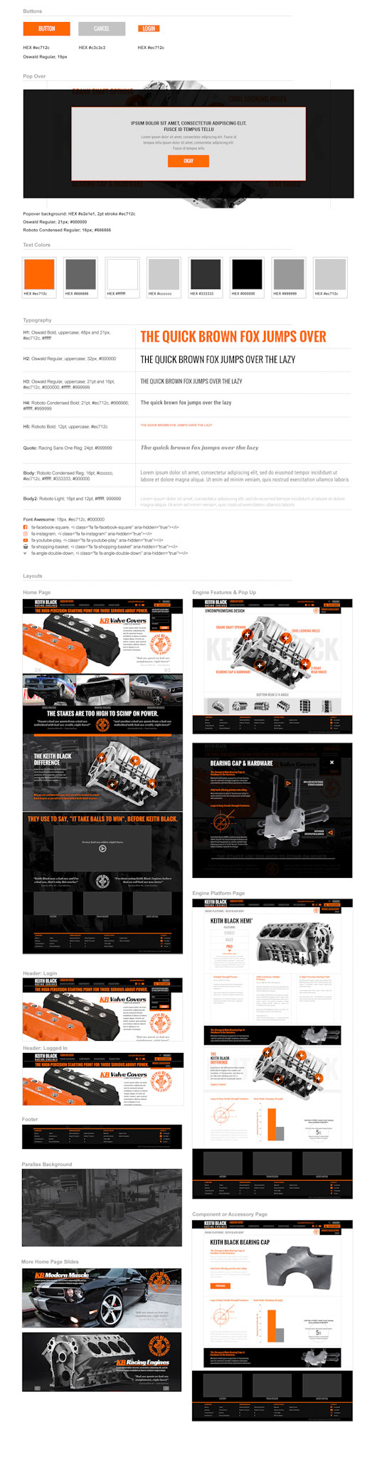
Final Product: Design Proofs and Stylesheet
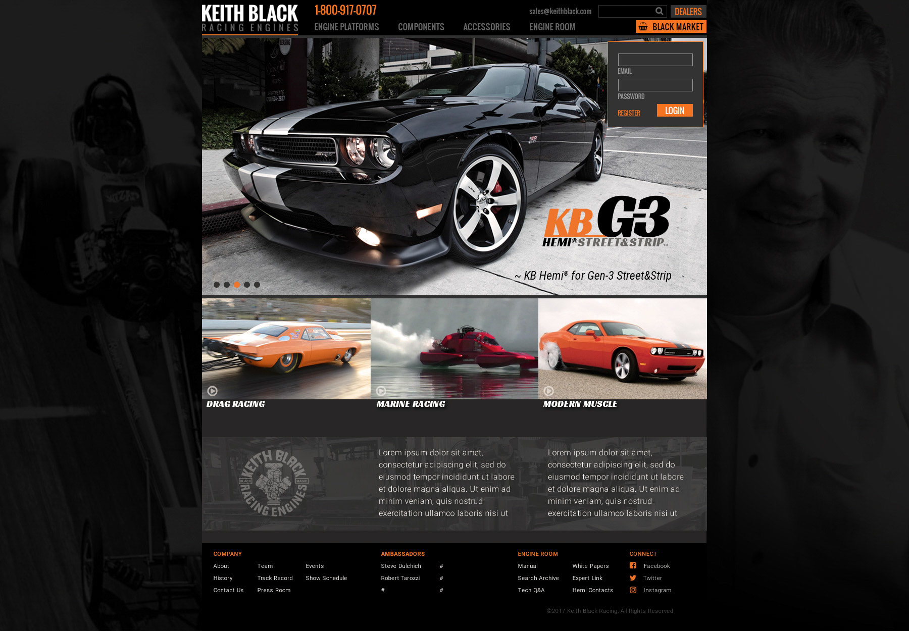
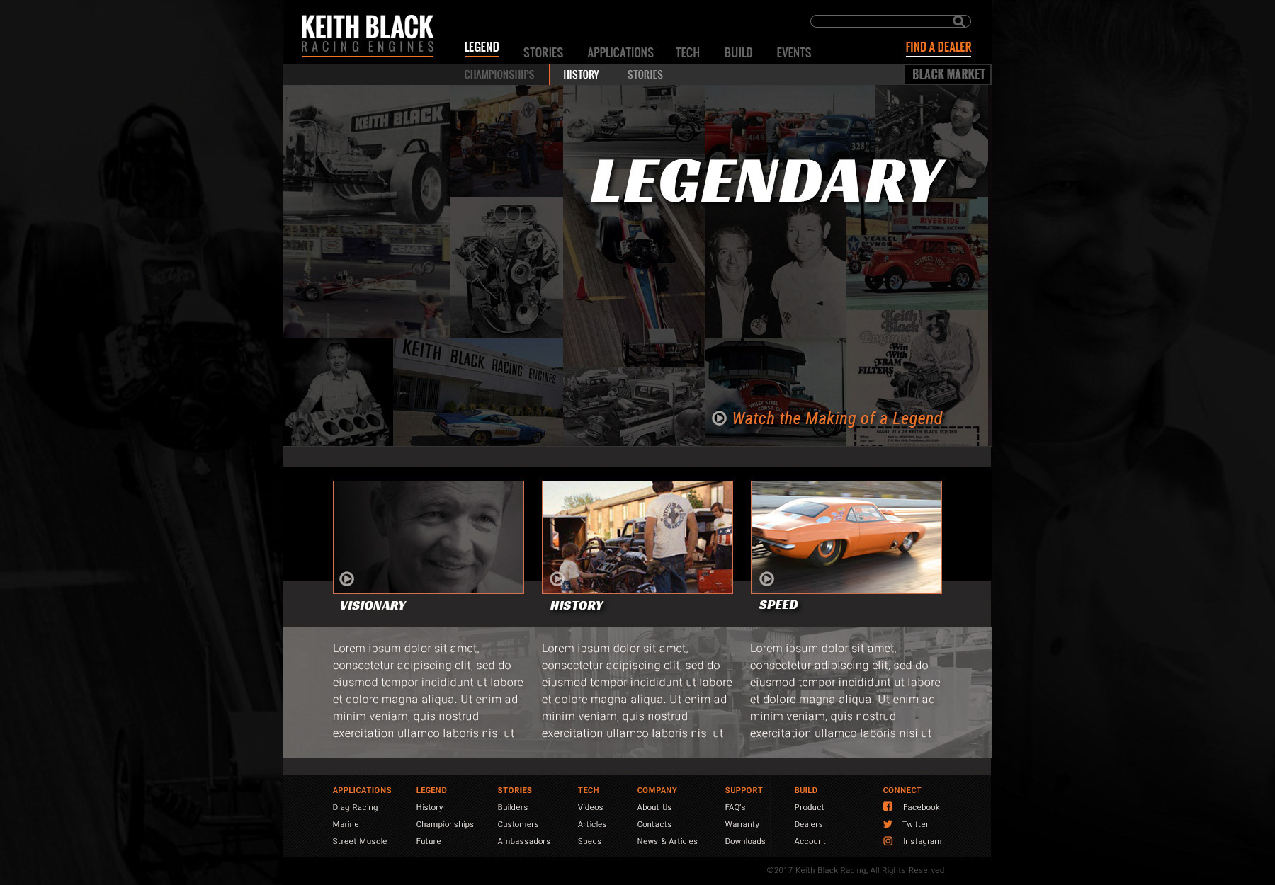
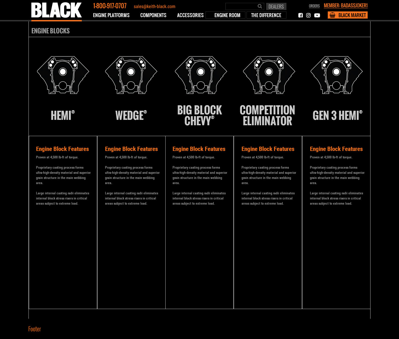
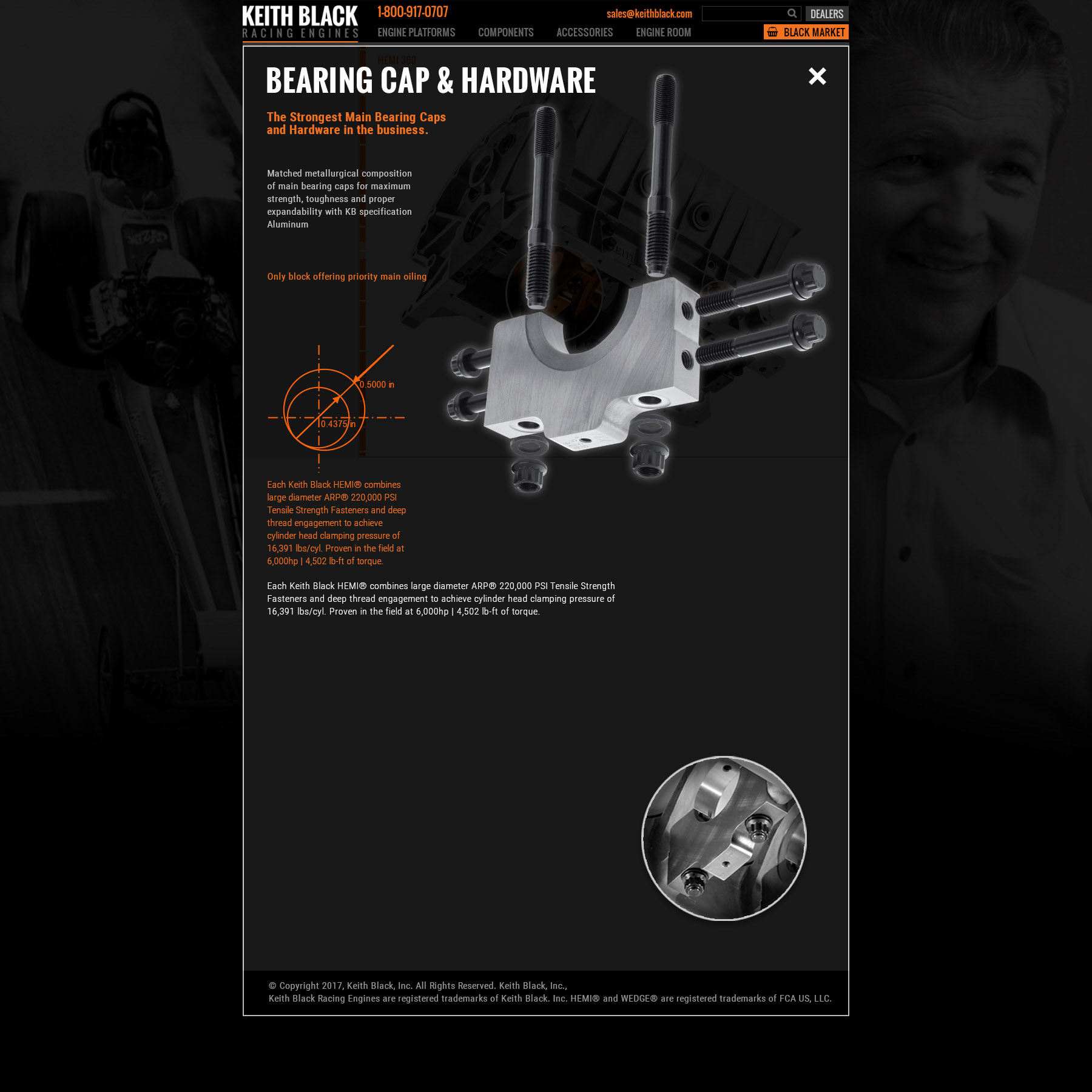
Direction: Continue with the branding styles developed during the brochure project. The site needs to provide a lot of technical data and resource links to the user. Website needs to convey the pride of the Keith Black name and history, as well as the confidence of an industry leader with a powerful and technically superior product then its competitors.
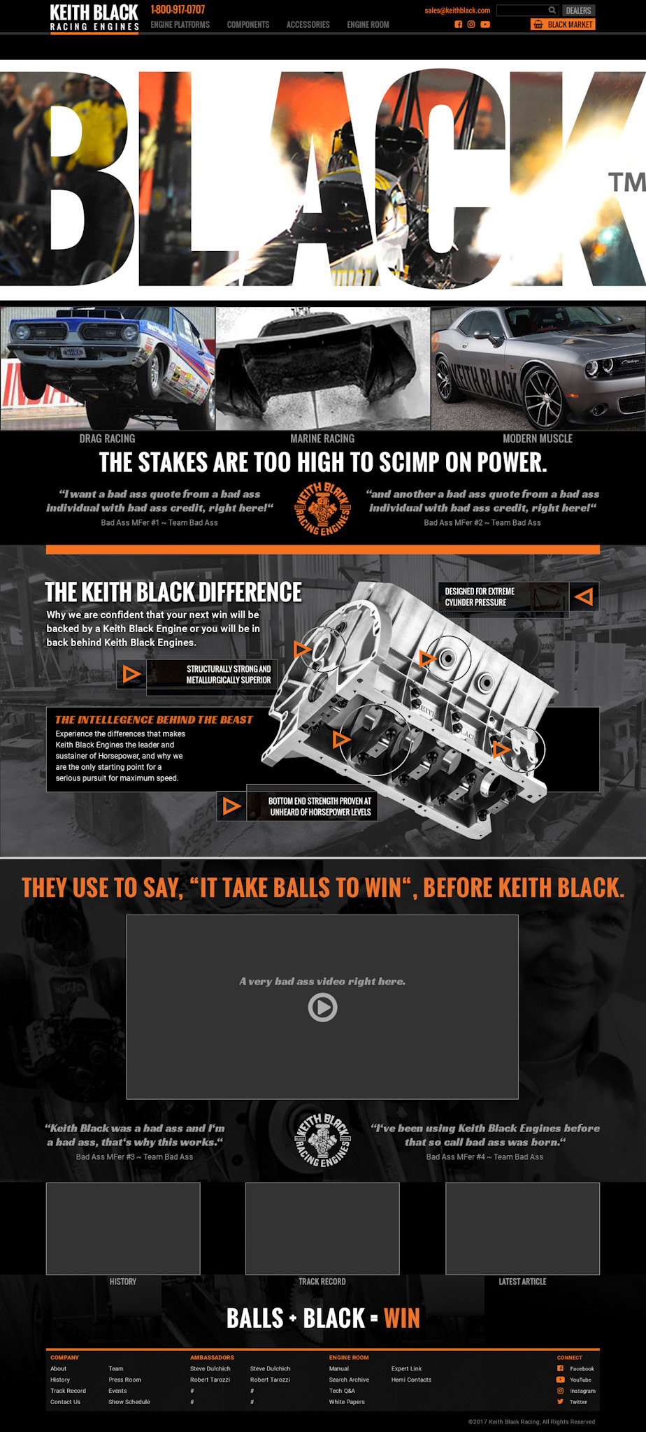
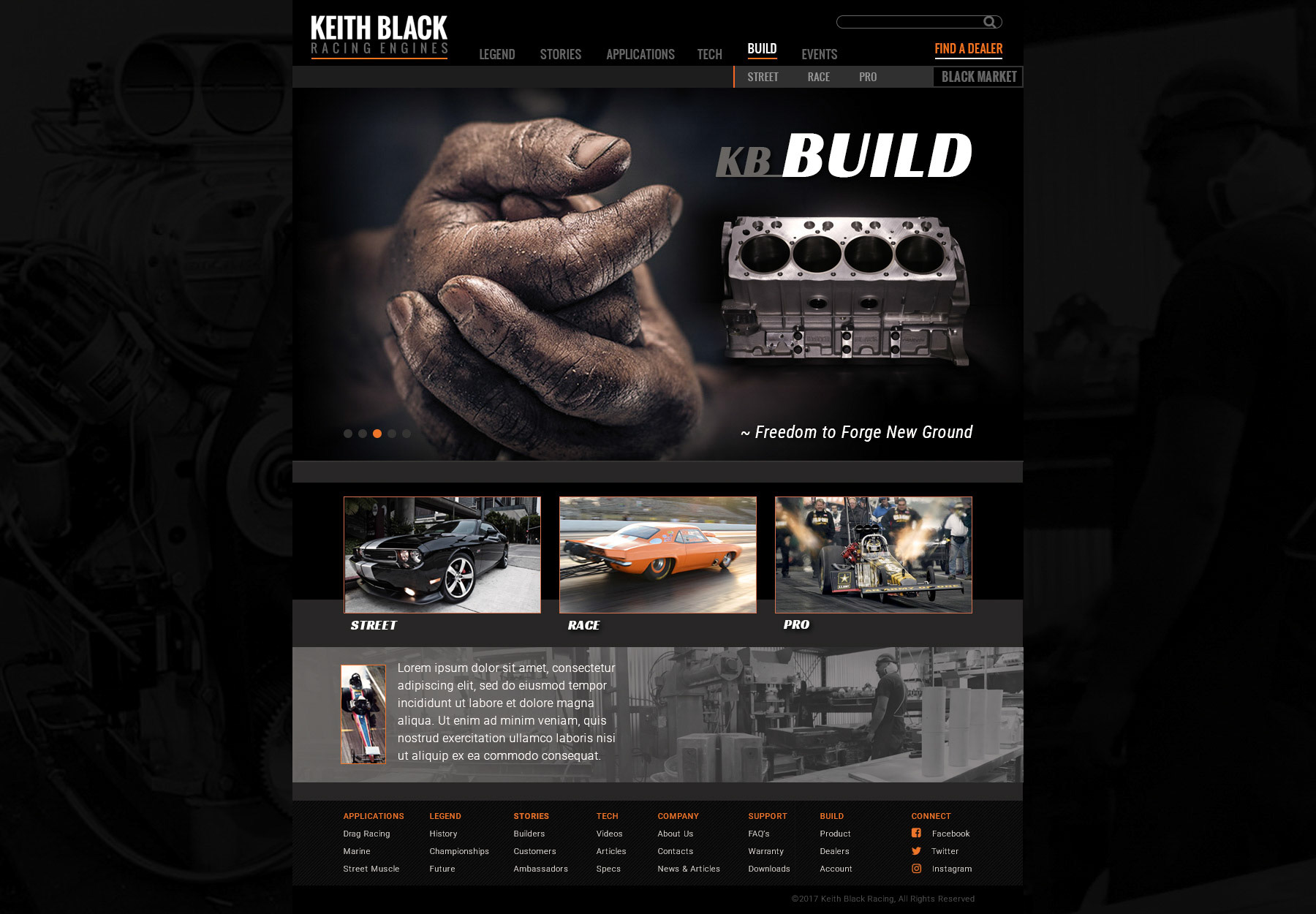
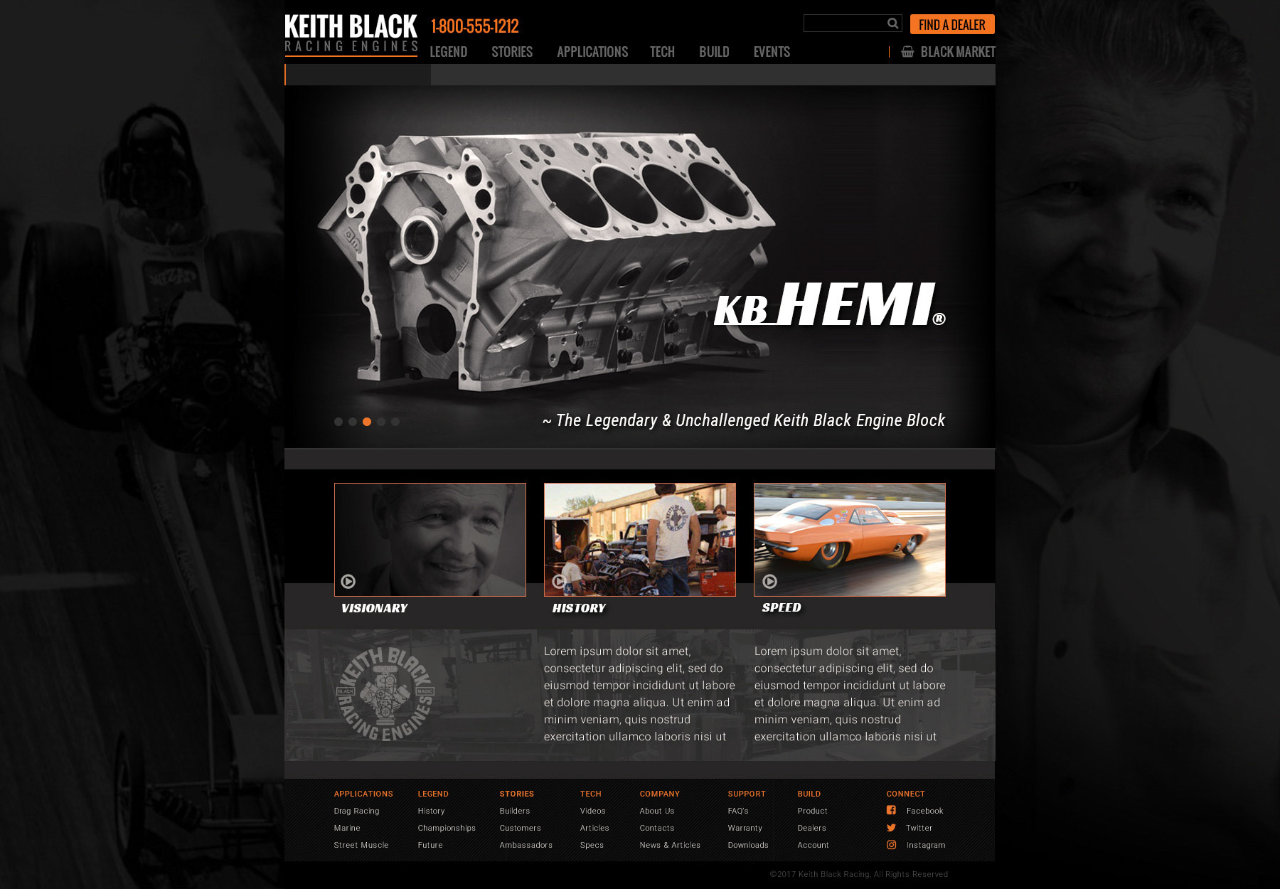
Design: Have a bold contrast by using both black and white pages worked with bold brand identity and the proposed image and text content. Leading pages black with white text and the opposite for the internal/technical pages. Layout to consider the use of historical photography, bold modern applications images and 360 photography of engine block.
A disruption in the transfer of ownership set back plans and at one time I was tasked to do a logo for a company named BLACK under Keith Black Inc. The extend time in litigation and the need to set up a new factory for manufacture delayed the delivery of content and the website launch. At the time I departed Icon Internet Media the website was still waiting on Keith Black Inc. for completion and launch.