Context
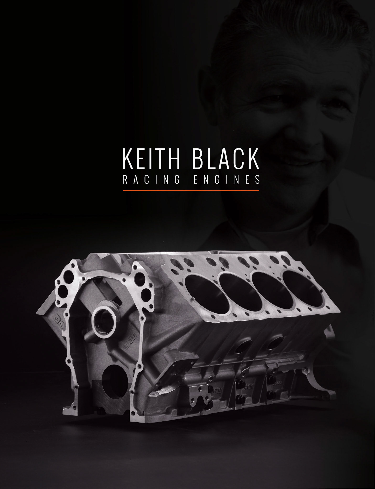
Keith Black was a legend in the racing world — a champion boat racer, speed record holder, and the pioneering mind behind top fuel racing engine blocks. Following his passing in 1991, his son continued operations, keeping the legacy alive by producing the renowned Keith Black engine blocks.
Over time, however, the company suffered from administrative decline. Despite the blocks maintaining their reputation as the best in the industry, the brand became plagued by poor customer service and excessively long lead times. Eventually, an investor group acquired Keith Black Racing Engines with a clear mission: to restore the brand to its rightful place at the forefront of high-performance racing. Their challenge was not only to preserve the legacy of excellence in engineering but also to rebuild trust and responsiveness in the marketplace.
Objective
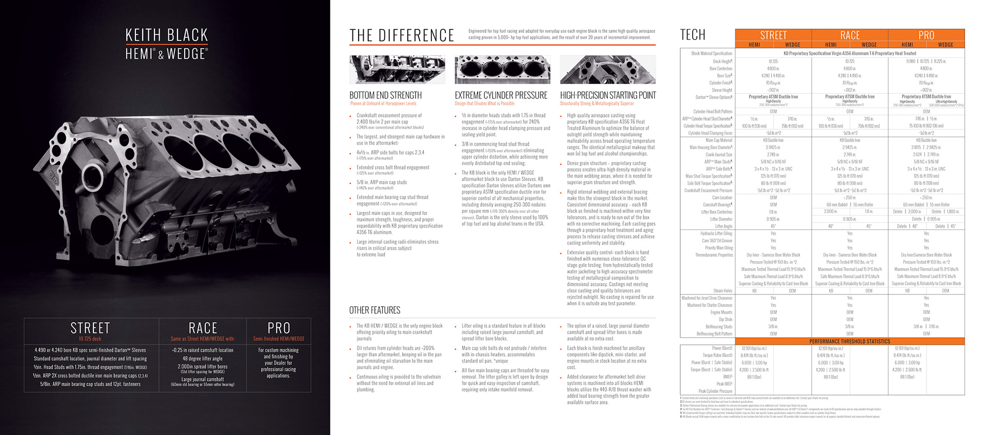
Develop a brand identity that positions the company as the gold standard and undisputed leader in the industry. The product is highly technical and performance-driven, backed by a legacy of innovation and excellence. The brand must reflect this heritage—rich in history and acclaim—while projecting a modern image of professionalism, reliability, and authority.
Branding Notes
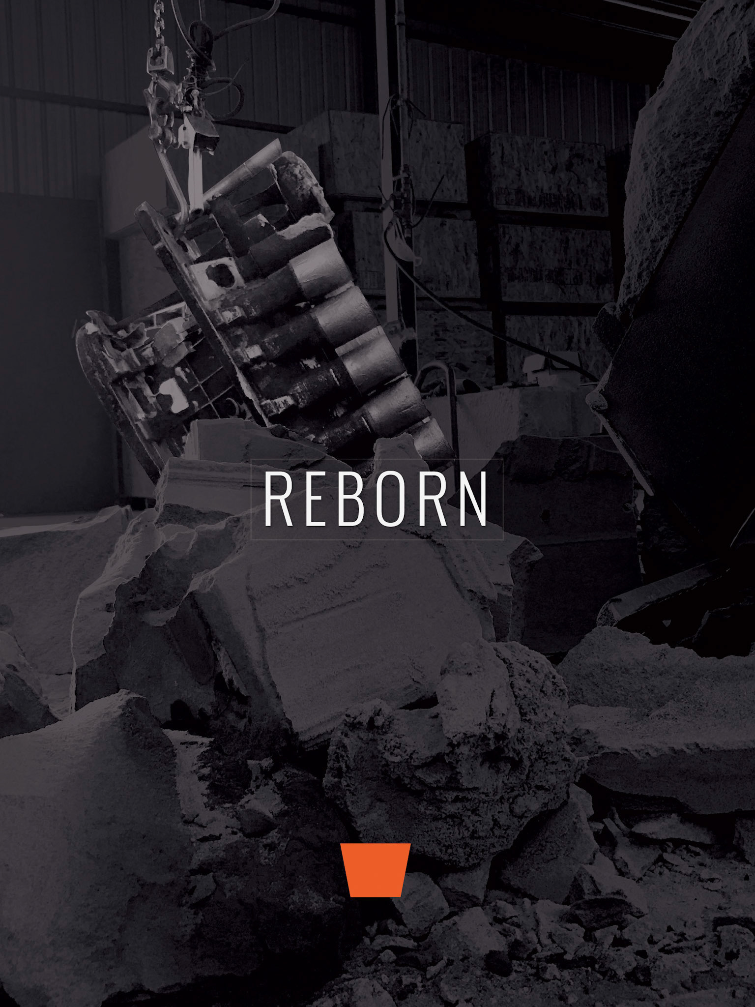
The initial direction for the brand’s color scheme was immediately clear. With the name “Black” and the legacy connection to HEMI engines—iconically known for their bold “HEMI Orange”—the choice of black and orange as the brand’s primary colors was both intuitive and meaningful. It also drew a subtle but powerful parallel to the branding success of Harley-Davidson, a company equally steeped in history and built on performance and attitude. This palette offered a strong value connection, grounding the brand in heritage while standing out in the high-performance market.
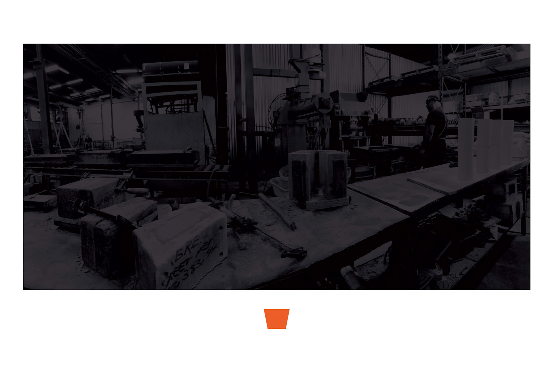
While exploring visual assets, I was drawn to the industrial character of factory imagery. The use of mid-tones and shadows provided a dramatic, authentic atmosphere ideal for backgrounds and supporting visuals. However, to ensure the brand's technical content remained legible and authoritative, clean and clinical white spaces were introduced—especially around text and data-driven elements. The stark contrast between black and white created a confident, no-nonsense visual tone that aligned perfectly with the company’s mission to reestablish itself as a professional and dependable leader in the racing industry.
Further brand development took place during the website design phase, where these visual cues were refined and extended into the digital experience.
Unfortunately, a disruption during the ownership transfer caused significant delays. At one point, I was tasked with creating a logo for a brand named BLACK, under the larger Keith Black Inc. umbrella. Extended litigation and the logistical challenges of setting up a new manufacturing facility pushed back timelines. As a result, content delivery and the website launch were postponed. When I departed Icon Internet Media, the website remained in a holding pattern—awaiting final assets and approval from Keith Black Inc. to move forward with launch.


KB_bro_in_V2.eps